Submitted 9 months ago
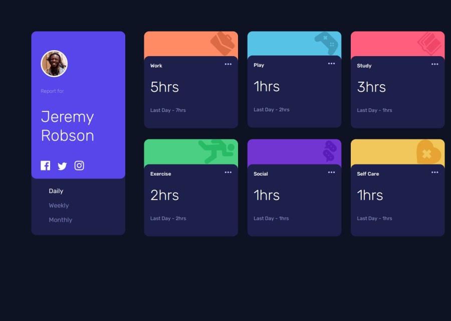
Time tracker | Sprinkled some of my design here-and-there

@Dubidimi

Design comparison
SolutionDesign

Solution retrospective
What are you most proud of, and what would you do differently next time?
I did everything same as before. Except, the media thingy for mobile view. In previous projects I was creating div for mobile view and then updating everything manually. but now I didn't do it . I'd like to stop spending so much time building designs separately for mobile and desktop views. Trynna do it simply.
What challenges did you encounter, and how did you overcome them?nothing i guess
What specific areas of your project would you like help with?How to write css code for mobile view - the media thingy
I want it short and less time consuming. im too lazy to write 200lines of code
Please log in to post a comment
Log in with GitHubCommunity feedback
- @IbrahimMurad
- Try to use mobile-first approach, it is much better.
- You DO NEED to use grid and flex display.

Join our Discord community
Join thousands of Frontend Mentor community members taking the challenges, sharing resources, helping each other, and chatting about all things front-end!
Join our Discord