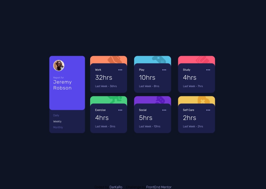
Time Tracker | React, BEM, SCSS
Design comparison
Solution retrospective
Feedback is appreciated
This is my very first React application! I decided I had to use a framework now that I'm in the JUNIOR challenges. If there's anything (and i'm sure there will be) that can be improved, you can tell me right away
This time I didn't try to make it pixel perfect since I was focusing more on React
I tried adding custom hover effects on the icons, custom animation for changing the option, and you can also delete a card by clicking on the three dots (I wanted to make a menu to do more stuff, but I wanted to finish it)
Things I'm uncomfortable with are the way I used images and the CSS being global instead for each component
Community feedback
Please log in to post a comment
Log in with GitHubJoin our Discord community
Join thousands of Frontend Mentor community members taking the challenges, sharing resources, helping each other, and chatting about all things front-end!
Join our Discord
