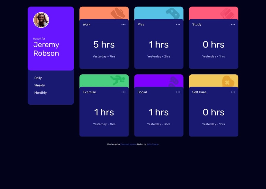
Time Tracker Dashboard with HTML, CSS and JavaScript with JSON data
Design comparison
Solution retrospective
It was difficult actually connecting the JSON data to the main design. Luckily, the links provided by Frontend Mentor as well as the community, helped me piece it together. But I would definitely practice this kind of coding more as it took quite a while to figure out.
Community feedback
- @YacoubDweikPosted 6 months ago
Hey Katie! good job! I know it needs more improvements but you with being trying and coding itself is a great achievement! For now I just want you to focus on the white spaces, there are lots of them in your design, I mean from small screens let's say 375px up to larger screens like 900px, you design is still the same, like the cards still in one column instead of spreading a little bit to take white spaces, this is because you hard coded the grid itself to be always 250px 1f 1fr 1fr,also you defined a fixed pattern for the grid by giving grid-area to each card, instead what I would really recommend you using is this for the parent container: grid-template-columns: repeat(auto-fill, minmax(250px, 1fr)); || try this and see the magic! btw this is the first time I heard about the island you live in so nice to meet you!
0
Please log in to post a comment
Log in with GitHubJoin our Discord community
Join thousands of Frontend Mentor community members taking the challenges, sharing resources, helping each other, and chatting about all things front-end!
Join our Discord
