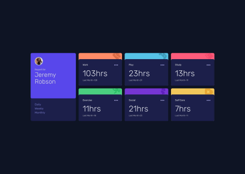
Time tracker dashboard using React.js and tailwind css

Solution retrospective
This is my first time trying out tailwind css and honestly, I'm a bit skeptical about it. The development time didn't cut down as I expected because maybe I'm a beginner in this, and the most annoying thing I encountered using tailwind and bootstrap is that it becomes too much verbose. The actual react code is about 30% and the rest is tailwind, which could have been reduced to 40% using css3 only. Ran into lot of difficulties with position and media query, but resolved it successfully (i guess).
I hope to like tailwind as well but for me, css3 wins the battle. Remember, this is just my opinion :)
Happy coding.
Please log in to post a comment
Log in with GitHubCommunity feedback
No feedback yet. Be the first to give feedback on Swagnik Das's solution.
Join our Discord community
Join thousands of Frontend Mentor community members taking the challenges, sharing resources, helping each other, and chatting about all things front-end!
Join our Discord