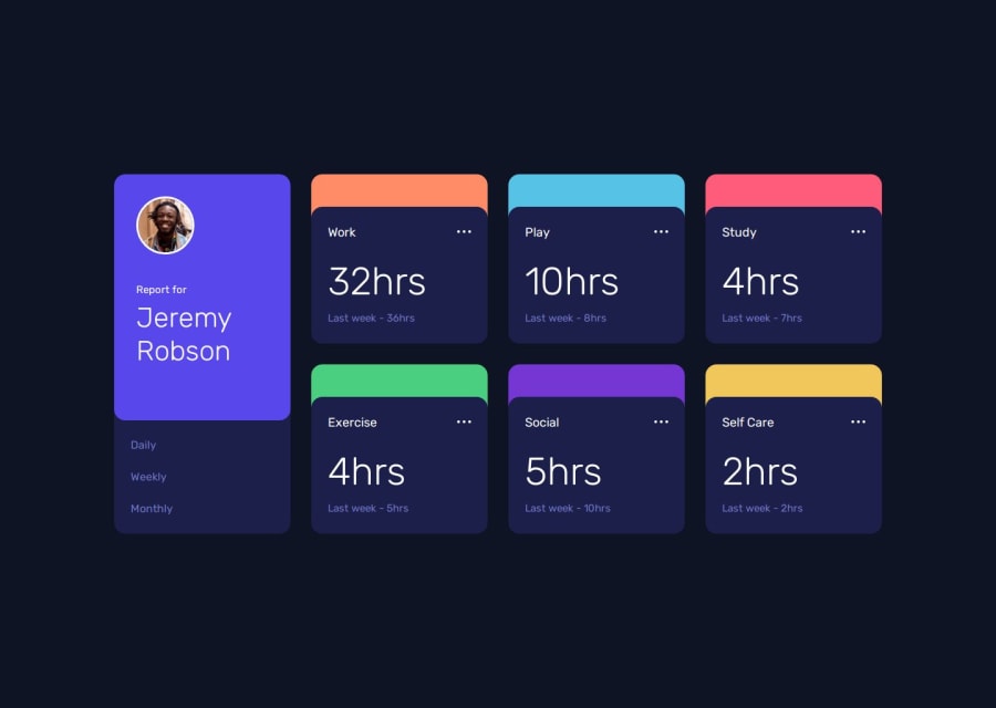
Time Track Pro: Responsive Activity Dashboard


Design comparison

Solution retrospective
I’m most proud of creating a user-friendly time tracker that effectively logs and displays time entries. Next time, I’d enhance the project by integrating more advanced features like data persistence with local storage or a backend database, and improving the design for better user experience.
What challenges did you encounter, and how did you overcome them?I faced challenges with accurately calculating and displaying time intervals and ensuring the UI was responsive across devices. I overcame these by thoroughly debugging my JavaScript code and using CSS media queries for responsive design. Testing across different browsers also helped refine the final result.
What specific areas of your project would you like help with?I’d like help with optimizing the JavaScript code for time calculations to ensure accuracy and performance. Additionally, feedback on enhancing the CSS for better responsiveness and visual appeal across various devices would be valuable. Any tips on integrating local storage to persist data would also be appreciated.
Community feedback
Please log in to post a comment
Log in with GitHub
Join our Discord community
Join thousands of Frontend Mentor community members taking the challenges, sharing resources, helping each other, and chatting about all things front-end!
Join our Discord