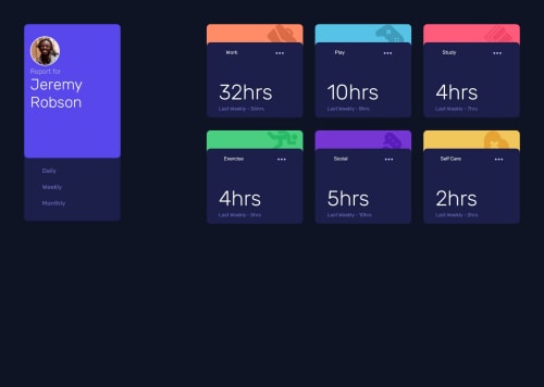
Submitted over 1 year agoA solution to the Time tracking dashboard challenge
Time-tracing-dashboard
@EAguayodev

Solution retrospective
What are you most proud of, and what would you do differently next time?
Pround of learning how to fetch local data.json file to display weekly, daily, monthly card data when clicking tabs.
What challenges did you encounter, and how did you overcome them?Challenges I overcame were aligning the html structure to set the right CSS grid properties to display the design. Starting the javascript code to fetch for the local data.json.
What specific areas of your project would you like help with?Would like help and feedback on whether the javascript code implemented in this challenge is heavy and if the code coul'dve been written with less lines to achieve the same result.
Code
Loading...
Please log in to post a comment
Log in with GitHubCommunity feedback
No feedback yet. Be the first to give feedback on Eric Aguayo's solution.
Join our Discord community
Join thousands of Frontend Mentor community members taking the challenges, sharing resources, helping each other, and chatting about all things front-end!
Join our Discord