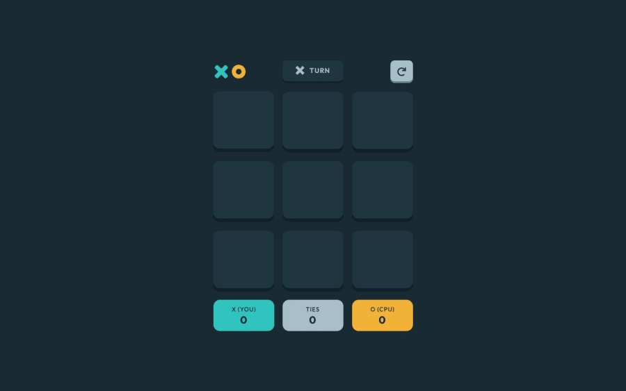
Tic-Tac-Toe made with React, Redux Toolkit, and Sass
Design comparison
Solution retrospective
Hello! Besides general comments and bug reports...
-
are there any React best practices or patterns I should look into?
-
my Redux game slice feels chunky, should I split it up?
-
any browser specific CSS/Sass styling errors?
Thanks!
Notes:
-
clicking the XO logo on either screen will access the difficulty settings
-
the modal is slightly transparent for game results to be visible through it
Community feedback
- @rmzvrPosted almost 3 years ago
Wow, great job, the code is well destructured, I like your writing style, I don't have enough redux knowledge to give hints yet. This project was next in my plans, maybe I will peep at your decision as inspiration)
The only thing I noticed was hovering over the buttons on the welcome screen: When hovering over the side select buttons, the pointer appears on the X and O icons themselves, and not on the entire button. When hovering over the buttons, there is also no new game pointer, it is not visually clear whether these buttons are active.
Marked as helpful1@rapidswingPosted almost 3 years ago@rzvr
Thank you for the feedback! The cursor issues have been fixed and deployed.
Redux is still fairly new to me, so this was a fun project to work on. I ended up having to reorganize my state a couple of times, but I learned a lot during the process.
0
Please log in to post a comment
Log in with GitHubJoin our Discord community
Join thousands of Frontend Mentor community members taking the challenges, sharing resources, helping each other, and chatting about all things front-end!
Join our Discord
