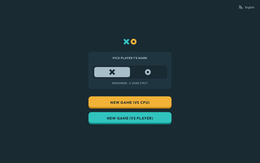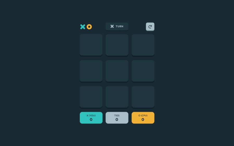
Design comparison
Solution retrospective
I'm most proud of having persistent states where the game is saved in the browser, and some custom additions to the challenge to make it more interesting.
What challenges did you encounter, and how did you overcome them?I had a lot of troubles syncing data between components, for example, making the computer make a move when it has to go first, I added a reactive state specifically for starting the game, checking if it's the user's or CPU's turn and make a move accordingly.
What specific areas of your project would you like help with?I wonder if some controls are good enough for accessibility, like using 1-9 to choose the boxes, but the boxes are "buttons" and probably not the 'right' HTML element for this purpose. What should I add/modify for accessibility?
Community feedback
- P@kaamiikPosted 5 months ago
Hi. congratulation for doing this challenge. I really liked your animations. Also the option to change language is really good. I noticed some other issues I wanna mention:
-
There is a responsive issue from about 384px to 780px. I think your game play header max-width need change.
-
When I confirm the restart button It does not come back to setup menu.
-
I think the part you choose a player to be X or O can be a group of radio buttons with fieldset and legend.
Marked as helpful1 -
Please log in to post a comment
Log in with GitHubJoin our Discord community
Join thousands of Frontend Mentor community members taking the challenges, sharing resources, helping each other, and chatting about all things front-end!
Join our Discord
