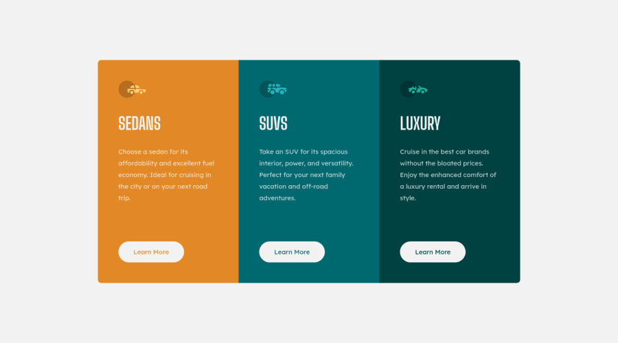
Three-column-preview-card-component using CSS Grid
Design comparison
Solution retrospective
This is my solution to the 3-column challenge, I used CSS grid and Flexbox, it was a simple project but the heights and spacing between elements were a challenge since it isn't as simple as a space-between or space-around. How would you do it? would you use a single div or multiple ones? Answer would be very appreciated.
Community feedback
- @elaineleungPosted over 2 years ago
Hi Oubaid, I think you did a great job :) I did this challenge a while back, I just had a look at it to see what I did; I saw that I mainly added margin at the bottom of elements to space them. I'm pretty sure if I were to do it again, I'd definitely do things differently. For the desktop view, I would use flexbox with gap to space out things (since flexbox gap has over a 90% usage by now), and then for the last item, I'd put a
margin-top: auto
to push it to the bottom, a bit like this:.card { min-height: 30rem; } section { display: flex; flex-direction: column; gap: 1rem; // or margin-bottom: 1rem instead } .cta { margin-top: auto; }
For the HTML, it'll just be pretty straightforward, probably no containers since none of the children need more containers for alignment.
<section> <img> <h2></h2> <p></p> <a href="#" class="cta"></a> </section>
Once again, well done, and great questions for discussion π
Marked as helpful1@oubaidelmoudhikPosted over 2 years ago@elaineleung Thank you very much for the feedback, I did play with the flexbox gap to space the elements, with that last child margin-top: auto, but since I didn't want to get @media involved, it brought problems in the mobile view, I will definitely try to redo the challenge with minimal HTML like you included, I know for a fact that my HTML is bloated.
I see you choose an <a> element for the CTA, is that better than the button element? And do you think I should go the @media route instead on relying on Grid to be responsive with the repeat(auto-fit, minmax(15em, 1fr))??
Again, than you very much for your feedback!
1@elaineleungPosted over 2 years ago@theniceguywastaken You're welcome, and yes, it's a good idea to keep experimenting, as that's how I usually end up learning a bunch of useful things, all from mistakes π
About using
<a>
instead of<button>
, it's mainly about function. Since it's a "learn more" CTA, most likely you'll be brought to another page after clicking on it, or maybe a popup modal, and buttons aren't meant to be used with links. With buttons, their job is more to initiate an action, as in to make it do something where you might even some Javascript to program what you want it to do, such as submitting a form, activating a click, etc. Hope this helps!1 - @Shard-CodesPosted over 2 years ago
Hello Oubaid, You great job on the challenge
Here are some tips to improve your solution.
- On the body tag add a min-height of 100vh like this.
body { background-color: var(--clr-very-light-gray); display: flex; justify-content: center; align-items: center; padding: 0; min-height: 100vh; /* Add this */ }
- On your container div remove the margin and min-height you set like this.
.container { display: grid; overflow: auto; margin: 5rem 1.5rem; /* Remove this */ grid-template-columns: repeat(auto-fit, minmax(15rem, 1fr)); min-height: 30rem; /* Remove this */ border-radius: 0.5rem; }
And also remove the min-height on your column element, as well.
And with that, you should be set Happy coding π
1@oubaidelmoudhikPosted over 2 years ago@Shard-Codes Hi, thank you very much for your feedback! I did try to implement those changes, but I lost the space around the container on mobile view (cause of the margin removal), and honestly I added the margins just for the mobile view. should I maybe nest them inside a @media?
0@Shard-CodesPosted over 2 years ago@theniceguywastaken Hello Oubaid, I'm sorry for that mistake with the margin. You can add a media query, And put a margin of 1rem from all sides on your container element and that should help.
Marked as helpful1
Please log in to post a comment
Log in with GitHubJoin our Discord community
Join thousands of Frontend Mentor community members taking the challenges, sharing resources, helping each other, and chatting about all things front-end!
Join our Discord