


Naveen Gumaste• 10,460
@NaveenGumaste
Posted
Hello Abdur Rouf Tarek ! Congo 👏 on completing this challenge
Let's look at some of your issues, shall we:
- Reduce the
font-sizeof theptag
happy Coding😀
0
Any feedback would be valuable and very much appreciated. Thank you.
@NaveenGumaste
Posted
Hello Abdur Rouf Tarek ! Congo 👏 on completing this challenge
Let's look at some of your issues, shall we:
font-size of the p taghappy Coding😀
@PhoenixDev22
Posted
Hello @rouftarek ,
Congratulation on completing this challenge,
I have some suggestions regarding your solution:
HTML
Using <section> tag for each card is not really a good choice . Section is not meant to be used anytime you feel tempted to use a div . section is for a bigger chunk of content often titled by <h2> Read more about usage notes.
About <h1> it is recommended not to have more than one h1 on the page .You can add a <h1> with class="sr-only" (Hidden visually, but present for assistive tech). Then you can use <h2> instead of those <h1>.
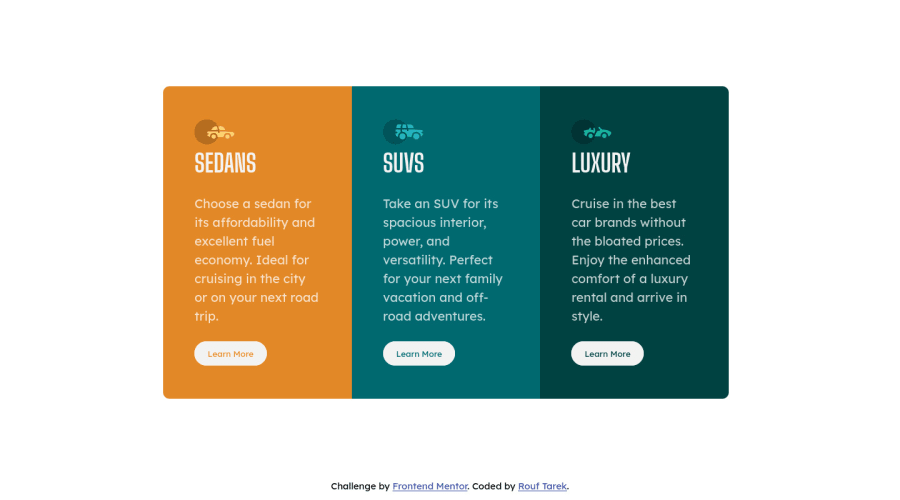
For any decorative images, each img tag should have empty alt="" as you did and aria-hidden="true" attributes to make all web assistive technologies such as screen reader ignore those images . In this challenge , all the images are decorative.
Clicking those "learn more" buttons would trigger navigation not do an action so button elements would not be right. And for future, it is essential if you include a button in a form element without specifying it's just a regular button, it defaults to a submit button, so it's a good idea to make a habit of specifying the type. So use the <a> .
Be careful when setting the width of an element using viewport units. Basically, you probably shouldn't use vw for width , you losing control of the layout . Since these units are based on viewport dimensions, it’s very convenient to use them in situations where the width, height or size of elements needs to be set relative to the viewport for large scale layout like column sizes or footers.
And it is essential that interactive elements have focus-visible styles as well as hover styles. These need to be really clear and obvious as they are needed to help a keyboard user know where is focused on the page.
height: 80hv;It's rarely ever a good practice to set heights on elements . Let the content inside the card element dictate the height of it.
border-radius andoverflow hiddento the main container that wraps the three cards so you don't have to set it to individual corners.
It's recommended to use em and rem units .Both em and rem are flexible, Using px won't allow the user to control the font size based on their needs.
Overall, your solution is good. hopefully this feedback helps.
Join thousands of Frontend Mentor community members taking the challenges, sharing resources, helping each other, and chatting about all things front-end!
Join our Discord
