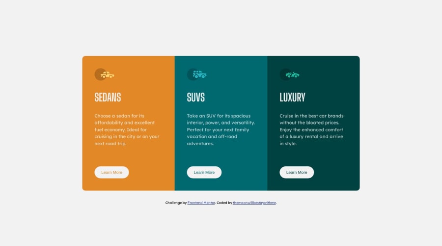
Design comparison
Solution retrospective
#Day 15 of frontend training For this piece, it took me 2 days to create. On the first day, I practiced doing it myself using the knowledge I gained from the past 10 days. After encountering a problem that I didn't understand, I went to study on YouTube. and solve problems until getting the finished product
Community feedback
- @AhlamAb22Posted about 1 year ago
Great job on your work! I have a few notes to share. I'm also in the process of learning and addressing past challenges to reach best practices. Here's some feedback I received that might be helpful to you:
-It's recommended to have only one h1 per page. For this task, consider using h2 headings for 'Sedans,' 'SUVs,' and 'Luxury.'
-Instead of using buttons, consider using anchors as these will navigate to other pages.
-Incorporating landmarks such as 'Main' and 'Footer' would improve the page's accessibility and structure.
2@ZENSE-THAIPosted about 1 year ago@AhlamAb22 Thank you very much for this advice. It is very beneficial to me.
1 - @ShalomiAhavahPosted about 1 year ago
Wow nice Job! Just keep practicing like that and you'll make it far!
1 - @Islandstone89Posted about 1 year ago
HTML:
-
Container class should be a
<main>. -
The images are decorative, so alt text should be empty:
alt = ""
CSS:
-
It's best practice to link the fonts in the
<head>of the HTML. -
Font-size should not be in px, but in rem.
-
Max-width on container should also be in rem.
-
You can remove
margin: 0 auto- the card is already centered using Flexbox. -
Set
margin-top: autoon the.btnto make the buttons align. -
Ideally you should do mobile styling as default, and use media queries (in rem) for larger screens.
1 -
Please log in to post a comment
Log in with GitHubJoin our Discord community
Join thousands of Frontend Mentor community members taking the challenges, sharing resources, helping each other, and chatting about all things front-end!
Join our Discord
