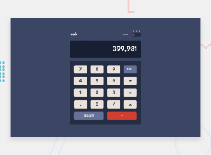
Three Themes Responsive Calculator ( js, sass). almost perfect π
Design comparison
Solution retrospective
Your Feedback Will Be Helpful.
Community feedback
- @ChromeUniversePosted about 2 years ago
Hi Hasan! Congrats on completing the challenge π
If you'd like to improve your current solution, here are a couple of suggestions:
- Use the League Spartan font on the calculator's display and make it bold so it matches with the rest of the design
- Maybe change the display from an
<input>
to a simple<p>
for displaying text? Input tags are best left to forms.
Other than that, great job! The app looks great on both desktop and mobile and works nicely too. I particularly liked the color transitions on the highlighted buttons. π If you're looking for an extra challenge, try rebuilding this with React! Highly interactive web apps such as this calculator are the perfect use case for building with components and introducing state management.
Hope this helps! Keep up the good work π
Marked as helpful1@cluod-AlfakhrePosted about 2 years ago@ChromeUniverse i am glad you liked it π€, i will consider your advices in the next solutions
0
Please log in to post a comment
Log in with GitHubJoin our Discord community
Join thousands of Frontend Mentor community members taking the challenges, sharing resources, helping each other, and chatting about all things front-end!
Join our Discord