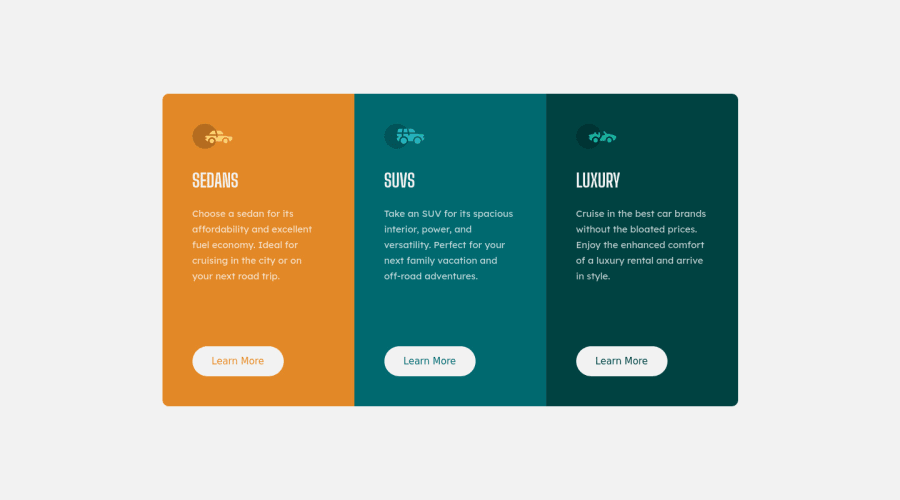
Design comparison
SolutionDesign
Community feedback
- @correlucasPosted over 2 years ago
👾Hello Võ Đức Lợi, congratulations for your new solution!
I've some tips for you about aligment and semantics:
You can replace the divs in the container for each card with
<article>to make clear the content inside the block, look that div is not a meaningful element, so prefer other tags for big blocks.You've missed
min-height: 100vhto make the vertical alignment using the body size in this case 100% of the viewport height:body { min-height: 100vh; font-family: 'Lexend Deca', sans-serif; font-weight: 400; height: 800px; display: flex; background-color: var(--neutral-Very-light-gray-background-headings-buttons); }👋 I hope this helps you and happy coding!
0
Please log in to post a comment
Log in with GitHubJoin our Discord community
Join thousands of Frontend Mentor community members taking the challenges, sharing resources, helping each other, and chatting about all things front-end!
Join our Discord
