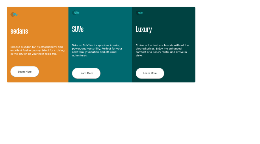
Design comparison
Community feedback
- Account deleted
Hello @KeerthiVasan-N,
Your solution look good and here are some tips to improve your solution:
- You can use Flexbox or CSS Grid to place your cards in the center of the page
Flexbox
body{
    display: flex;
    align-items: center;
    justify-content: center;
    min-height: 100vh;
}
CSS Grid
body{ display: grid; place-content: center; min-height: 100vh; }- Every document should contain a
<main>because a<div>is a non-semantic element which means it does not explain the content. - More information about HTML Semantic Elements
I hope this helps you and good luck
2 - @KeerthiVasan-NPosted about 2 years ago
Thank you for valuable feedback Sir I'll improve the sematic-ness in my further challenges
0 - @VCaramesPosted about 2 years ago
Hey there!👋 Here are some suggestions to help improve your code:
-
The car images/icons in this component are purely decorative; They add no value. So their Alt Tag should left blank and have an aria-hidden=“true” to hides them from assistive technology.
-
The “SEDANS”, “SUVS” and “LUXURY” are headings so they need be wrapped in a Heading Element. Since each heading in this card has the same level of importance an <h2> Heading will be the best choice.
-
Your "buttons" were created with the incorrect element. When the user clicks on the button they should directed to a different part of you site. The Anchor Tag will achieve this.
If you have any questions or need further clarification, let me know.
Happy Coding! 👻🎃
0 -
Please log in to post a comment
Log in with GitHubJoin our Discord community
Join thousands of Frontend Mentor community members taking the challenges, sharing resources, helping each other, and chatting about all things front-end!
Join our Discord
