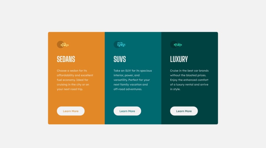
Design comparison
SolutionDesign
Solution retrospective
I wasn't always getting space at the bottom of the screen as was shown in the mobile layout, when adding a margin-bottom. So I created a "footer" div with a height that kicked in on mobile layouts. This solved the problem. I know, not a critical thing for the layout, but it was there and I wanted to be sure it was included.
Any ideas of why margin-bottom wouldn't have worked? And/or other ways of implementing it?
Community feedback
Please log in to post a comment
Log in with GitHubJoin our Discord community
Join thousands of Frontend Mentor community members taking the challenges, sharing resources, helping each other, and chatting about all things front-end!
Join our Discord
