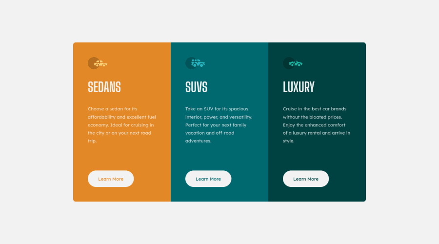
Three Column Preview Card Component with animations and semantic HTML
Design comparison
Solution retrospective
Hello, everyone!
I have a really small question regarding the animations I used in this project. (Just for some context - this is the first time I've ever used animations for something in HTML and CSS.) Is there any way to make the animations 'stagger' a bit? Like complete the first set for the first card, wait a few milliseconds and then move on to the next, etc?
If anyone knows the answers and decides to respond, thank you in advance! I hope you all have an amazing day / night.
Community feedback
- @HassiaiPosted over 1 year ago
The html must have <h1> to fix the accessibility issues.
Every html must have <h1> to make it accessible. Always begin the heading of the html with <h1> tag wrap the sub-heading of <h1> in <h2> tag, wrap the sub-heading of <h2> in <h3> this continues until <h6>, never skip a level of a heading.
To center .cards on the page using grid, add min-height: 100vh to the body .
Hope am helpful.
Well done for completing this challenge. HAPPY CODING
1@ZascuOfficialPosted over 1 year ago@Hassiai Thank you for addressing the accessibility issue, but the cards are already centered on the page using min-height: 100vh on the body. That line of CSS is in another file I use to overwrite some default browser styles, called
reset.css. It's in my repository.Anyways, I appreciate the advice!
0
Please log in to post a comment
Log in with GitHubJoin our Discord community
Join thousands of Frontend Mentor community members taking the challenges, sharing resources, helping each other, and chatting about all things front-end!
Join our Discord
