Design comparison
Solution retrospective
Looking for feedback and anything that I could of done better.
Community feedback
- @pikapikamartPosted almost 3 years ago
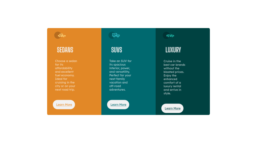
Hey, awesome work on this one and congrats as well for your first challenge here at FEM! Hope you had fun doing this challenge and learned from it:>. For desktop layout, it just needed it to be centered and it's good to go.
Here are some other suggestions for the site:
- It would be great to have a base styling of this:
html {
  box-sizing: border-box;
  font-size: 100%;
}

body {
 margin: 0;
}

*,
*::before,
*::after {
  box-sizing: inherit
}
This way, handling an element specially its size will be easier because of the
box-sizing- In a webpage, your main-content should be wrapped inside the
maintag so that it will be easy for the user to know and navigate on themainlandmark. For this one, create amaintag that will wrap the 3 card. - Normally, I would suggest using a flexbox to center the layout on this challenge, but since there is not container that wraps the 3 card, using flexbox on the
bodywill just ruin it. But if you manage to create amain, then use:
align-items: center;
display: flex;
flex-direction: column;
justify-content: center;
min-height: 100vh;
Styling on the
bodytag.- On each of the
divcard, instead ofheightusemin-height. Usingheightwill give an explicit /fixed sizing on the element making it not scale base on it's content, whilemin-heightwill allow the element to resize if needed. - Also, you could have create a single selector like
.cardthat you can give on each of the card on the layout, this way you won't have to manually add the stylings on each of thesedan, suv, luxuryselector. - For each of the car icons, they are only acting as decorative images. Decorative images are just images that doesn't contribute to the overall content of the site. They should be hidden for screen-reader at all times by using
alt=""andaria-hidden="true"to theimgtag or onlyaria-hidden="true"if you are usingsvginstead ofimgtag. - In any webpage, you should have a single
h1tag, usually it is the first heading tag inside themaintag. It describes the content of the site, but since there is no visible heading text on this one, you should create theh1as screen-reader onlyh1. Have a look at this solution of Grace on the same challenge. Inspect the website and see how she used theh1and the stylings applied to it. - Those "learn more" are better using
atag rather thanbuttonbecause on a real site, those would be page links for the user to visit and "learn more" about a specific car.
Aside from those, great job again on this one.
Marked as helpful2@jkhaygoodPosted almost 3 years ago@pikapikamart I really appreciate the feedback! I have been doing online course and wanted to step away and try something on my own.
Im going to try what you said!
1
Please log in to post a comment
Log in with GitHubJoin our Discord community
Join thousands of Frontend Mentor community members taking the challenges, sharing resources, helping each other, and chatting about all things front-end!
Join our Discord
