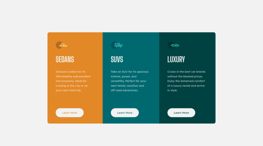
Design comparison
Solution retrospective
Any feedback will be appreciated. :)
Community feedback
- @rickyssj2Posted almost 4 years ago
Nicely done. One suggestion is to add the hover effect on the focus state also for the people using 'tab' to navigate the website.
1@mcdulingmPosted almost 4 years ago@rickyssj2 thanks for the feedback! I didn't even consider it so thank you very much. Will definitely add it.
0 - @PanuGrPosted almost 4 years ago
Hi. I like the transition effect on the buttons. When you hover over the buttons the cursor doesn't change.
1@mcdulingmPosted almost 4 years ago@PanuGr The transition is so easy yet elegant. Thanks for noticing.
And thanks for the reminder on the cursor. There's always something I forget. Will add it.
0
Please log in to post a comment
Log in with GitHubJoin our Discord community
Join thousands of Frontend Mentor community members taking the challenges, sharing resources, helping each other, and chatting about all things front-end!
Join our Discord
