Design comparison
SolutionDesign
Community feedback
- @chintriagoPosted about 3 years ago
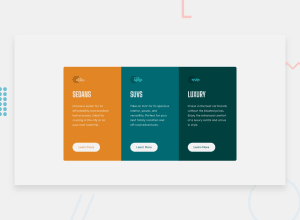
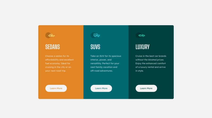
It looks really good and close to the original! also the responsiveness is good. As for feedback, You forgot to change the background-color of the body to very light gray, the lower case s in SUVs, and it's really hard to read your bottom footer. I'm not too familiar with the accessibility side but you should look into it since it says there some issues.
Marked as helpful1
Please log in to post a comment
Log in with GitHubJoin our Discord community
Join thousands of Frontend Mentor community members taking the challenges, sharing resources, helping each other, and chatting about all things front-end!
Join our Discord
