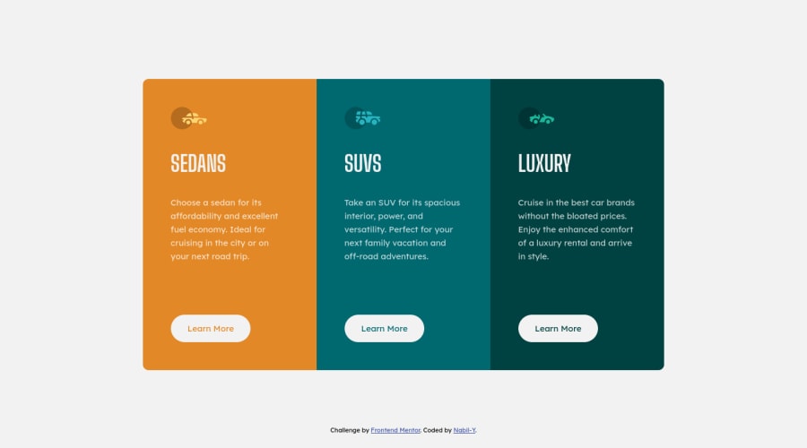
Design comparison
Solution retrospective
Welcome !
Thank you for looking at my work.
I am a beginner so please tell me if you see anything I can improve on.
Nabil-Y
Community feedback
- @bramuccciPosted over 3 years ago
Hey this looks really nice! Here are some picky details that I would change: -The cards are typically articles, not sections (see https://developer.mozilla.org/en-US/docs/Web/HTML/Element/article). So is better to do main>article>div (each part of the big card is a div) -Instead of btn-one, btn-two, btn-three, you could use variables. Put a '--color-accent' and change for every div
But these are minor things, you did great 😃
Marked as helpful1@Nabil-YPosted over 3 years agoHi @Liltanie,
Although I know the basics of semantic html, I still don't understand very much when to use a section or an article or aside etc... Anyway, thanks for the feedback and for pointing out where I can learn more about this.
1
Please log in to post a comment
Log in with GitHubJoin our Discord community
Join thousands of Frontend Mentor community members taking the challenges, sharing resources, helping each other, and chatting about all things front-end!
Join our Discord
