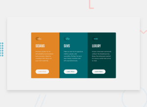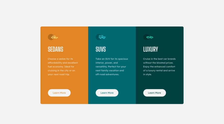
Design comparison
Solution retrospective
Any feedback would be greatly appreciated.
Community feedback
- @dwhensonPosted over 3 years ago
Hi @hariramjp777 very nice work on this one! 🙌
Not much that I can suggest for improving things, some very small suggestions are:
-
Perhaps try using
text-transform: uppercasefor theh2elements rather than typing the actual letters in uppercase - a very small deal!! - but a good habit to get into in case you need to change the design later. -
Another tiny point, you probably don't need
alttext for the icons as they aren't really descriptive content. I would probably just leave the "" empty, which means that screen readers will just skip the element and go to the headings.
These are really small points though!! Keep up the great work and happy coding! 👍 Cheers 👋
1 -
Please log in to post a comment
Log in with GitHubJoin our Discord community
Join thousands of Frontend Mentor community members taking the challenges, sharing resources, helping each other, and chatting about all things front-end!
Join our Discord
