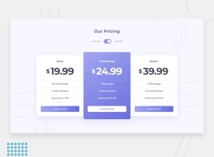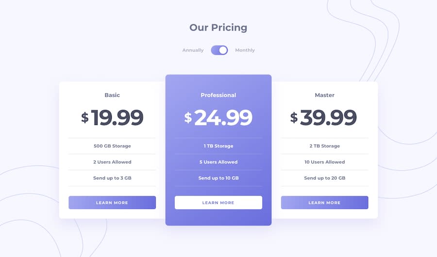
Submitted over 4 years ago
This project is made by using html, css and vanilla javascript
@g4rry420
Design comparison
SolutionDesign
Solution retrospective
Hello Everyone, I have just completed this project and would love to have you feedback on this. Thank You
Community feedback
- @mattstuddertPosted over 4 years ago
Nice work on this challenge, Gurkiran! You've done a really good job and your solution looks great. There are a couple of pointers I've got on your HTML code after taking a look:
- I'd say the features in each box are a list of features. This means a
ulmight have been more appropriate thanh5elements withhrelements between. Thelielements could then have aborder-bottomto match up to the design. - For the "Learn More" text, you've uppercased the content in the HTML itself. Try to avoid doing that as some screen reader software will read this content letter-by-letter which makes that content inaccessible to screen reader users. Instead, write it normally in your HTML and then use
text-transform: uppercase;in your CSS to visually uppercase the text to match the design.
I hope this helps. Keep up the great work!
2@g4rry420Posted over 4 years ago@mattstuddert Thank You for your comment and I will make that changes right away.
0 - I'd say the features in each box are a list of features. This means a
Please log in to post a comment
Log in with GitHubJoin our Discord community
Join thousands of Frontend Mentor community members taking the challenges, sharing resources, helping each other, and chatting about all things front-end!
Join our Discord
