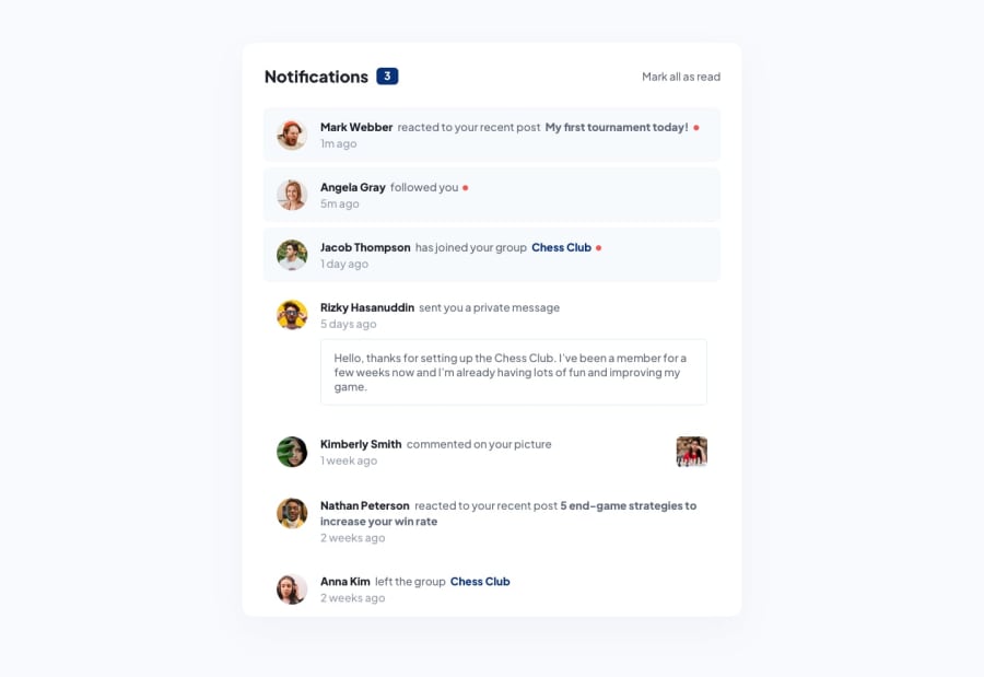
This is the responsive notification done using css preprocessor scss
Design comparison
Solution retrospective
It was simple . But was quite stuck, i will use percentage units next time when i will move from desktop to smaller devices.
What challenges did you encounter, and how did you overcome them?The challenge was how to make chess image of a girl there and i did that using position absolute and it's parent to position relative.
What specific areas of your project would you like help with?Feel free to give your suggestion and feedback, i am always down and open to learning new ways of doing the same project.
Community feedback
- @KorneyChervonenkoPosted 6 months ago
Hello friend, It seems to me that you have added event listener to every unread notification but what if you have hundreds or thousands of those? Your JS would be inefficient. It’s better to add only one event listener to some container of notification elements and after click event just find out which notification was clicked exactly
0@bigyandulal2Posted 6 months ago@KorneyChervonenko Thank you sir , for your review on my website. I will note that and fix that in the project.
0
Please log in to post a comment
Log in with GitHubJoin our Discord community
Join thousands of Frontend Mentor community members taking the challenges, sharing resources, helping each other, and chatting about all things front-end!
Join our Discord
