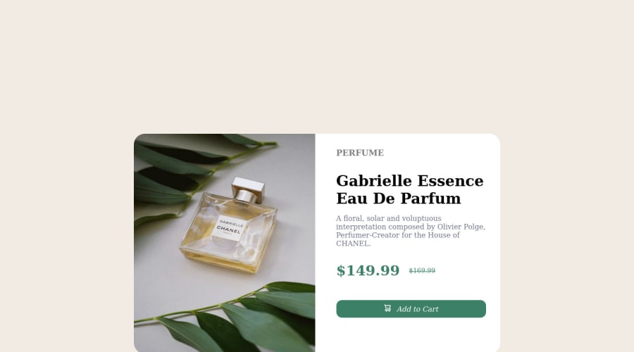
This is my solution for product-preview-card-component-main
Design comparison
Solution retrospective
Hey!! I am looking forward to see feedbacks. The main thing I wanna get suggestions on is how could i optimize.
Community feedback
- @yishak621Posted about 2 years ago
hi partah congrats for completing the challenge 3 basic things i want to comment about are 1]...the main challenge for this specific project is to design responsive card for pc version(1row with 2column grid) and for mobile(1column with 2rows) and the images for each version is different in the images folder u will find two images for two source sets .. 2].these practical challenge helps me to practice how to set a resolution switching image according to the screen sizes so we have given two diffrent images 1x and 2x for small and wider screens so whenever the screen size changes from 750px the image we provide will be changed automatically! these is how it is done
<picture> <source srcset="images/[email protected] 750w, images/[email protected] 1200w" /> <img src="images/[email protected]" /> </picture>
beside the card grid layout will be change from 1x2 to 2x1 for mobile versions ! and also it have something to practice on text-decoration property for price tag we must put line-through and the thickness should be very thin<div class="old__price"><h2 class="old__price__tag">$169.99</h2> </div>
.old__price__tag { font-weight: 400; text-decoration-line: line-through; text-decoration-thickness: 0.1em; }
3]use felx or grid to display the whole card in the center of the screen for example if<div class="container"> <div class="card"> </div> </div>
the parent container for the card.container{ display:flex; justify-column:center; align-items:center; height:90vh; }
Marked as helpful0@BingolastPosted about 2 years ago@yishak621 ooh shoot thanks for that. I thought there was only image given. I spend 2hrs on internet so I could fix. Thank you (Im stupid!)
0@yishak621Posted about 2 years ago@Bingolast u r not stupid u r just learning ....keep coding and keep learning ....don't stop
0 - @IssamAthPosted about 2 years ago
You should center your product card vertically using flexbox and align center
0
Please log in to post a comment
Log in with GitHubJoin our Discord community
Join thousands of Frontend Mentor community members taking the challenges, sharing resources, helping each other, and chatting about all things front-end!
Join our Discord