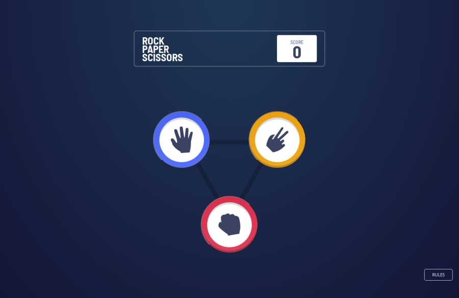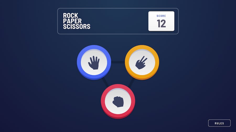
Design comparison
Solution retrospective
The uniqueness of this project lies in its simplicity yet engaging nature, allowing me to focus on managing state, persisting data with localStorage, and enhancing the user experience through CSS transitions and animations.
What challenges did you encounter, and how did you overcome them?The entire project was an enormous challenge. Keeping the game state (scores) consistent across page reloads. I used localStorage to save and retrieve the state. This way, the game could maintain the player's progress and scores even after a page reload.
Enhancing the user experience with smooth transitions and animations. Solution: I used CSS transitions to animate the state changes, such as sliding the options off-screen and bringing in the fight scene. CSS animations were also applied to highlight the winner.
What specific areas of your project would you like help with?I'd like help with ensuring the project works well on mobile devices.
Community feedback
- @ArpadGBondorPosted 9 months ago
Hi,
The animation is soo fast, it gives me a headache. I think you should give it a bit longer transition duration. Also, the blue circle component is missing its bottom part.
Wish you good luck with fixing it, and keep up the good work! :)
Gabriel
0
Please log in to post a comment
Log in with GitHubJoin our Discord community
Join thousands of Frontend Mentor community members taking the challenges, sharing resources, helping each other, and chatting about all things front-end!
Join our Discord
