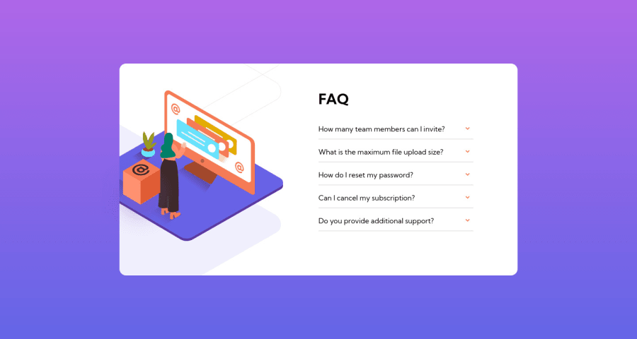
Design comparison
Solution retrospective
Don't forget to tell me if something is wrong in my code or if I can improve my code and give your opinion/feedback.
Community feedback
- @vanzasetiaPosted over 2 years ago
Hi, Nabil! 👋
Good job on this challenge! 👏
First, make each of the
buttonelements a child element of theh2. This will preserve the semantic meaning of the heading and the button. Also, usearia-expandedto tell assistive technologies about the state of the accordion (whether it is expanded or collapsed).The easiest solution to create an accessible accordion is to use the native HTML elements -
summaryanddetails.I have some more suggestions to improve this solution.
- Avoid using JavaScript to add styling (unless you have no other option). JavaScript allows you to change the CSS code using the
styleproperty. But, to make debugging easier and improve code maintainability, it’s best to avoid it. Use CSS classes instead. - Give all the buttons the same class name. Then, use
querySelectorAllto select all the buttons. Then, useforEachto add a "click" event listener to each button. This way, you can avoid selecting each of the buttons. - I recommend using all classes that begin with
js-to select DOM elements within JavaScript. This helps you to separate the styling and the functionality of the elements. Keep in mind, that only use thejs-classes only for JavaScript purposes.
I hope this helps. Happy coding!
0 - Avoid using JavaScript to add styling (unless you have no other option). JavaScript allows you to change the CSS code using the
Please log in to post a comment
Log in with GitHubJoin our Discord community
Join thousands of Frontend Mentor community members taking the challenges, sharing resources, helping each other, and chatting about all things front-end!
Join our Discord
