Not Found
Not Found
Not Found
Not Found
Not Found
Not Found
Not Found
Not Found
Not Found
Not Found
Not Found
Not Found
Not Found
Not Found
Not Found
Not Found
Not Found
Not Found
Not Found
Not Found

Submitted

This is a React TypeScript project leveraging SASS

Jeff 210

@W4GFO

Desktop design screenshot for the Product preview card component coding challenge

This is a solution for...

  • HTML
  • CSS
1newbie
View challenge

Design comparison


SolutionDesign

Solution retrospective


This project may seem over architected but I was trying to envision a larger project and how I might actually separate out the components. I would love to hear others' thoughts on this.

I did have some issues configuring font for multiple paragraphs and you can see this in the /src/Components/DisplayElements/Styles/ContentDisplayStyle.scss on lines 39 & 45. Wasn't sure if this was the right way to do this or not.

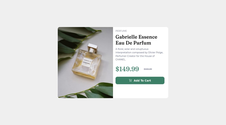
Also, the image in desktop view scales fine, but I'm not sure I did this in the best way possible. I use background-size cover but again, not certain this is the best way to do things.

Community feedback

Lucas 👾 104,420

@correlucas

Posted

👾Hello @W4GFO, Congratulations on completing this challenge!

Your solution its almost done and I’ve some tips to help you to improve it:

Use the THE PICTURE TAG that is a shortcut to deal with the multiple images in this challenge. So you can use the <picture> tag instead of importing this as an <img> or using a div with background-image. Use it to place the images and make the change between mobile and desktop, instead of using a div or img and set the change in the css with display: none with the tag picture is more practical and easy. Note that for SEO / search engine reasons isn’t a better practice import this product image with CSS since this will make it harder to the image. Manage both images inside the <picture> tag and use the html to code to set when the images should change setting the device max-width depending of the device desktop + mobile.

Check the link for the official documentation for <picture> in W3 SCHOOLS: https://www.w3schools.com/tags/tag_picture.asp

See the example below:

<picture>
  <source media="(max-width:650px)" srcset="./images/image-product-mobile.jpg">
  <img src="./images/image-product-desktop.jpg" alt="Gabrielle Parfum" style="width:auto;">
</picture>

👨‍💻Here's my solution for this challenge if you wants to see how I build it: https://www.frontendmentor.io/solutions/product-preview-card-vanilla-css-and-custom-hover-state-on-hero-85A1JsueD1

✌️ I hope this helps you and happy coding!

Marked as helpful

0
Jeff 210

@W4GFO

Posted

Hello @correlucas Lucus,

Wow! Thank you so much for the feedback. Unfortunately, I get a 404 when following your link, but I will dive into the picture tag for sure.

Thank you again for the time you took taking a look at my project.

Best, Jeff

0

Please log in to post a comment

Log in with GitHub
Discord logo

Join our Discord community

Join thousands of Frontend Mentor community members taking the challenges, sharing resources, helping each other, and chatting about all things front-end!

Join our Discord