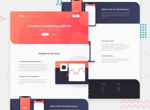
This Blogr landing page challenge hub with a little bit of js
Design comparison
Solution retrospective
Although I ended up taking too much time and tried to imitate many sites with similar condition, I finally could finish this challenge If you don't mind, feel free to give me any suggestion, thanks.
Community feedback
- @ChamuMutezvaPosted almost 3 years ago
Greetings Tiar
- the
mainelement is very important , it should be available in a site. Maybe put the sections with the classeslanding, design, state and laptopinto themainelement - the hamburger is an image with a div as its parent, hence it will not be identified as a button by assistive technology. Using semantic element improves accessibility. You can change the div into a button and change the click handler to be activated by the button.
- the only permitted child of a
ulis anlielement - the hr and div cannot be direct children of a ul - the
learn moreandstart for freeare more likely anchor elements , that is for navigation to a section or another page . - the general display looks good, but it needs some improvements as some content is sitting on top of other content , especially on mobile and medium devices
Happy coding
Marked as helpful0@ATiarKPosted almost 3 years ago@ChamuMutezva okay thanks, it seems that I still have many things to learn from here on .
-
Sorry, I just know that there is <main> element used in HTML. Okay, I'll make sure to use it from now on.
-
As for the hamburger, actually I don't really understand how to make it correctly, right now. I've been searching and trying to imitate from many sources but it seems doesn't do well.
-
um, about the line, I just remember about hr that I learned in the past. So, I thought to use that to make kind of separation. but is there any other choice that I can use there?
-
As for the button of learn more & start for free, should I make it redirected to some section, for example?
Well, thank you very much. I started this design based on the desktop version of 1440p, but my resolution still limited to the 1366p. Which makes me not very clear about the display on the 1440p screen. That's why I used a browser to customize the 1440p and 375p displays. That might be my reason because the @media screen setting to make it really responsive is quite confusing at the moment. at least for me
I'll try to keep improving myself again. thanks again @chamu
0 - the
Please log in to post a comment
Log in with GitHubJoin our Discord community
Join thousands of Frontend Mentor community members taking the challenges, sharing resources, helping each other, and chatting about all things front-end!
Join our Discord
