Submitted over 2 years ago
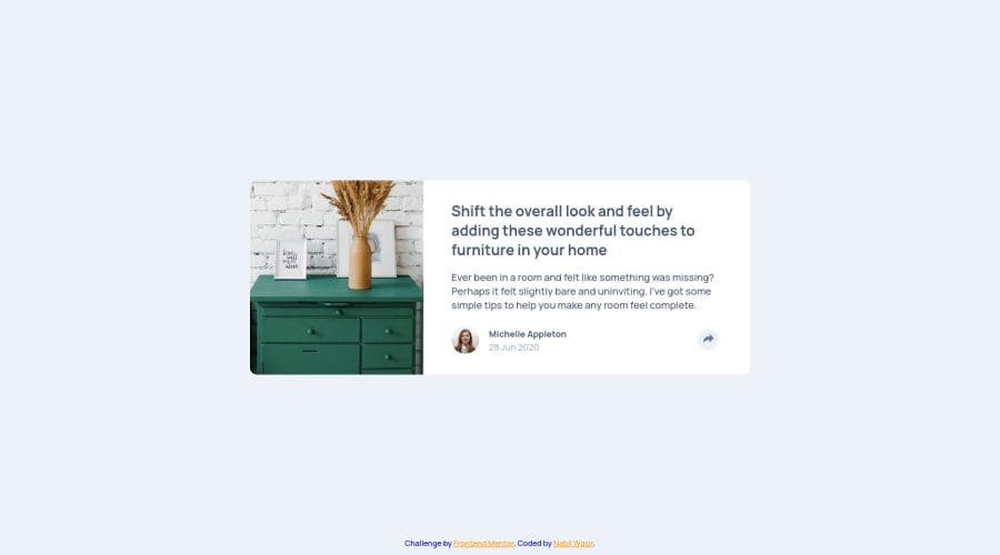
This a solution Article Preview Component challenge
@NabilWasir
Design comparison
SolutionDesign
Solution retrospective
Don't forget to tell me if something is wrong in my code or if I can improve my code and give your opinion/feedback.
Please log in to post a comment
Log in with GitHubCommunity feedback
- @Jonathanthedeveloper
Hey Nabil, whilst your solution looked great, I however noticed that you used px and now your solution isn't fully responsive on some mobiles changing you width units to % percentages would go a long way
example you could do
.main-container {
  width: 60%;
}
Join our Discord community
Join thousands of Frontend Mentor community members taking the challenges, sharing resources, helping each other, and chatting about all things front-end!
Join our Discord
