Submitted about 3 years ago
Third project: Mobile first site using HTML and CSS
@zarkogolocorbin
Design comparison
SolutionDesign
Solution retrospective
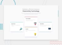
Hello everyone! Here is my solution Four card feature section. Any feedback or suggestions are welcome. Thank you!
Community feedback
- @thiago-hdsPosted about 3 years ago
HI! It looks really great!
Just two small things:
- The "Calculator" and "Karma" cards are in different positions that they are on the design.
- You could use the em unit for breakpoints to make the layout more flexible in case the user changes the browser default font size.
Keep it up!
Marked as helpful1 - @kens-visualsPosted about 3 years ago
Hey @zarkogolocorbin 👋🏻
Your layout with grid looks excellent, However, I have some suggestions.
- I just noticed that boxes for Calculator and Karma are swapped. Just fix
grid-areaand that should do the trick. - For the
<img>tags, I'd suggest addingaria-hidden="true"because those images are for styling purposes only. You can read more aboutaria-hiddenhere
I hope this was helpful 👨🏻💻 you did a great job, keep it up. Cheers 👾
Marked as helpful1 - I just noticed that boxes for Calculator and Karma are swapped. Just fix
Please log in to post a comment
Log in with GitHubJoin our Discord community
Join thousands of Frontend Mentor community members taking the challenges, sharing resources, helping each other, and chatting about all things front-end!
Join our Discord

