

Design comparison

Solution retrospective
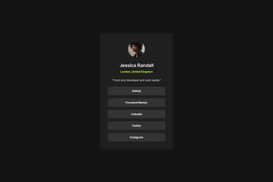
Hello! I'm back again, very excited to share with you my solution to this challenge! 😊
In this challenge, I faced some problems with flexbox, particularly in the navigation part. The fact that when centering the flex-items inside the flex-container, you "lose" space inside the container, made it very difficult for me to get the right background for the links, so that they look like buttons.😓
What specific areas of your project would you like help with?In particular, I would like help with the part where I had the most difficulty, in the nav. 😅
Is there a better or alternative way than the one I used to get the appropriate background for the links? 🤔
Also, is there a way to center the link text vertically and horizontally within its parent container (li)? I only managed to do it after defining that the anchors would be flex-containers. 😣


Join our Discord community
Join thousands of Frontend Mentor community members taking the challenges, sharing resources, helping each other, and chatting about all things front-end!
Join our Discord