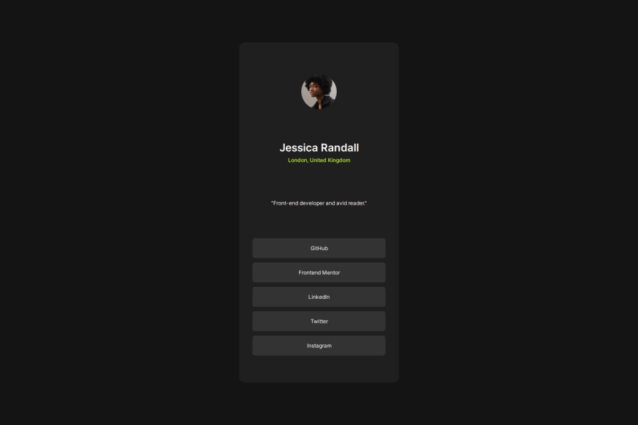
Design comparison
SolutionDesign
Solution retrospective
What are you most proud of, and what would you do differently next time?
Im recreating without any style guide or prototype, maybe nextime im trying to design on figma first and implementing at my code.
What challenges did you encounter, and how did you overcome them?Without using any style guide, especially while encountering the size of the element its challanging.
What specific areas of your project would you like help with?Still i want to increase with my responsive layout specially using display:grid. Because im still using display:flex to arrange everything
Community feedback
Please log in to post a comment
Log in with GitHubJoin our Discord community
Join thousands of Frontend Mentor community members taking the challenges, sharing resources, helping each other, and chatting about all things front-end!
Join our Discord
