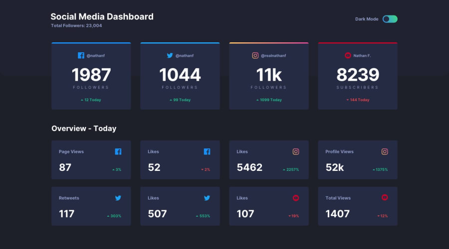
Theme-Switching Social Media Dashboard w/ React, TypeScript, SASS
Design comparison
Solution retrospective
-
In my Card component, I had a lot of conditions to display certain styles and values if the props met those conditions. Would this structure be acceptable, or would it have been better to break the Card down into sub components to be more manageable to read?
-
I think I was a bit meticulous about having multiple nested objects in my data.ts file. It definitely shows in my Card component, as the className of almost every tag were quite long. At that point, should I have created utility classes, like in TailwindCSS, rather than follow the BEM style? Or, would the BEM still work, just that I would need to tweek my structure a bit more efficiently?
Community feedback
Please log in to post a comment
Log in with GitHubJoin our Discord community
Join thousands of Frontend Mentor community members taking the challenges, sharing resources, helping each other, and chatting about all things front-end!
Join our Discord
