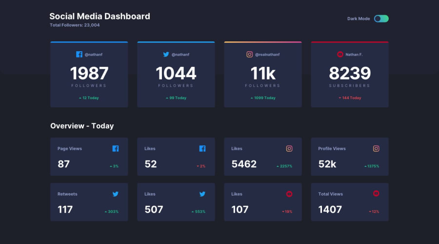
Design comparison
SolutionDesign
Solution retrospective
I think I've got a pretty good solution on this one.
My only question is about the switch button? What's a good practice to style this properly? Is mine okay?
Any feedback is welcome!
Community feedback
- @ApplePieGiraffePosted about 4 years ago
Hey, Pierre! 👋
You did a nice job! Your solution is responsive and your toggle switch looks good. 👍
I suggest,
- Wrapping the content of the page in a container and setting a
max-widthon that container so that the boxes don't look overly stretched on large screens. - At around 700-600px, some of the text content in the first row of boxes overflows their containers and get cut off on the sides. You might want to look into that.
Keep coding (and happy coding, too)! 😄
0 - Wrapping the content of the page in a container and setting a
Please log in to post a comment
Log in with GitHubJoin our Discord community
Join thousands of Frontend Mentor community members taking the challenges, sharing resources, helping each other, and chatting about all things front-end!
Join our Discord
