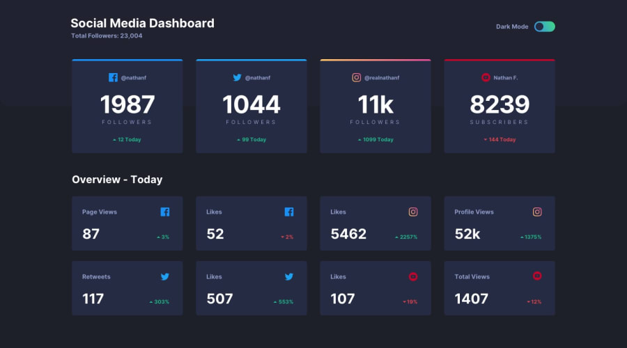
Design comparison
Solution retrospective
Hey 👋🏾
I followed the CSS Tricks article: A Complete Guide to Dark Mode on the Web to create the theme switcher. It works like this:
When you visit the page for the first time, it would use your OS's color theme. So, for example, if you have your OS's dark theme turned on, you would see the page in the dark theme. Then when you change the theme of the page, your new preferred theme would be saved in your browser (in local storage). So the next time you visit the page, you'd see it in your preferred theme.
If you've taken this challenge, I'd like to know, are the cards supposed to be links? The active-state designs show them to be "hoverable".
Also, I'd like to know if there's something I can improve in my solution. Thank you!
Community feedback
Please log in to post a comment
Log in with GitHubJoin our Discord community
Join thousands of Frontend Mentor community members taking the challenges, sharing resources, helping each other, and chatting about all things front-end!
Join our Discord
