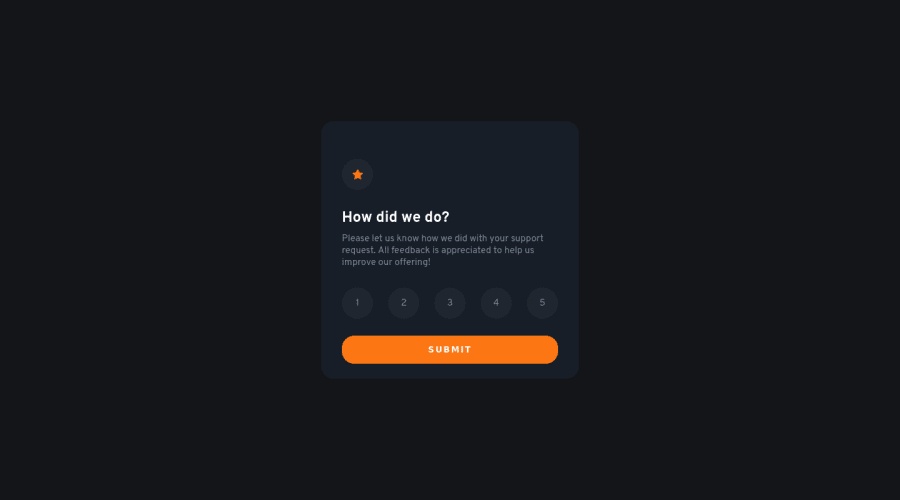
Design comparison
Solution retrospective
Thanks to everyone who visited my solution and i hope maybe someone gives some feedback or suggestion to improve my code
Community feedback
- @fazzaamiarsoPosted over 2 years ago
Halo Fadll! Udah mantap solusinya!
Cuman mau kasih tips. buat
const allRating = document.querySelectorAll(".radio-input");mending ditaruh di luar sama selector yang lain di atas. Kalo di dalem function nanti dia harus terus-terusan di lakuin ulang tiap klik.Semoga bisa bantu ya!
1 - @Sdann26Posted over 2 years ago
Hello Muhammad Fadll!
In terms of design I think you have a good responsive design as well as the design when you switch to the other card.
On the issue of functionality I would recommend that when clicking on submit do not leave the default value of 4, rather if the user has not chosen any of the values do not allow him to give submit.
Also I do not recommend to use section because you are creating a component at the end that is a card that can be reused, use section when you are going to include sections in your page not necessarily in separate components because you will get a lot of those errors in the report.
If you can add the property transiton to the elements that use pseudoclasses like :hover, :active, :focus, etc. so that at the moment of activating a state the change is not so abrupt but rather that it is seen with certain delay for example:
transition: color 200ms.1
Please log in to post a comment
Log in with GitHubJoin our Discord community
Join thousands of Frontend Mentor community members taking the challenges, sharing resources, helping each other, and chatting about all things front-end!
Join our Discord
