Design comparison
SolutionDesign
Solution retrospective
Hey Folks!!! :)
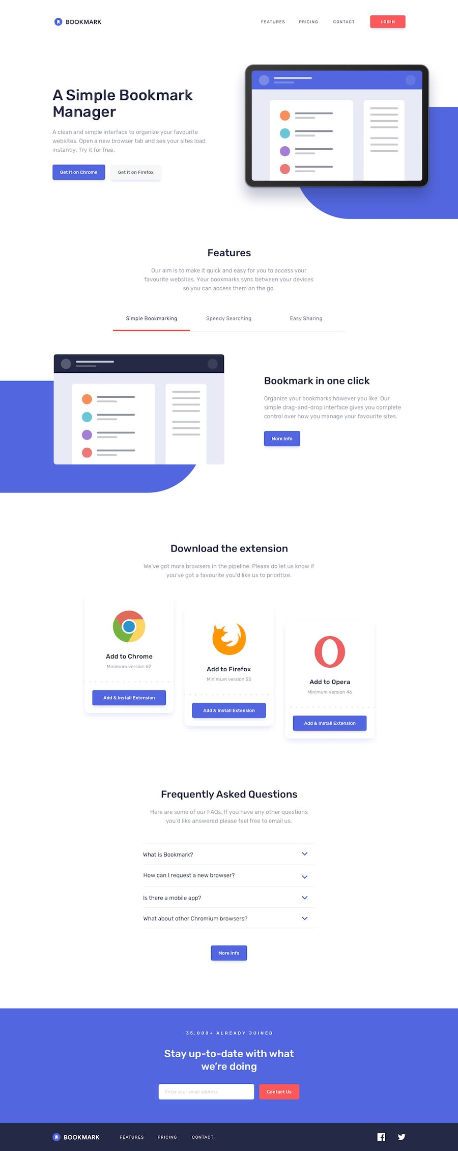
I have created this landing but didn't use the blue round background. Instead, I have added animations to the landing page to make it look more dynamic and vibrant. Please do share your feedback guys!!!!
Community feedback
Please log in to post a comment
Log in with GitHubJoin our Discord community
Join thousands of Frontend Mentor community members taking the challenges, sharing resources, helping each other, and chatting about all things front-end!
Join our Discord
