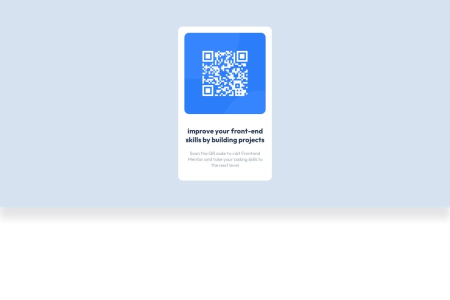
the responsive page is written in pure CSS and HTML
Design comparison
Solution retrospective
next time I would like a project with a layout in figma
What challenges did you encounter, and how did you overcome them?After a pull request on Git Hub, the site was not displayed, I had a 404 error, as it turned out, it was necessary to transfer the page index.html to the root of the file, and the photo was not uploaded, while everything was ok locally, I decided to add a dot at the beginning of the path to the file and everything worked
What specific areas of your project would you like help with?I generally need more projects and more practice
Community feedback
- @joshutikPosted 8 months ago
-
Does the solution include semantic HTML? Yes it does Includes some HTML semantic.
-
Is it accessible, and what improvements could be made? Yes I hosted it, for A start I don't have any improvement that could be added.
-
Does the layout look good on a range of screen sizes?
yes it does it is responsive on every screen size. -
Is the code well-structured, readable, and reusable? Yes it is well structured and is reusable.
-
Does the solution differ considerably from the design? Yes by a tiny bit.
0 -
- P@Islandstone89Posted 8 months ago
HTML:
-
Every webpage needs a
<main>that wraps all of the content, except for<header>andfooter>. This is vital for accessibility, as it helps screen readers identify a page's "main" section. Change.containerto a<main>, and removerole="main">- amainelement has that role by default. -
Remove
.canvas, you don't need that<div>. -
The alt text should be written naturally, without using
-between the words. Write something short and descriptive, without including words like "image" or "photo". Screen readers start announcing images with "image", so an alt text of "image of qr code" would be read like this: "image, image of qr code". The alt text must also say where it leads(the frontendmentor website). A good alt text would be "QR code leading to the Frontend Mentor website." -
Change "improve" to "Improve".
-
I would change the heading to a
<h2>- a page should only have one<h1>, reserved for the main heading. As this is a card heading, it would likely not be the main heading on a page with several components.
CSS:
-
I would recommend adding
1remofpaddingon thebody, to ensure the card doesn't touch the edges on small screens. -
You can remove
font-optical-sizing: autoandfont-style: normalfrombody, as these are default values. -
To center the card horizontally and vertically, I would use Flexbox on the body:
display: flex; flex-direction: column; justify-content: center; align-items: center; min-height: 100svh;-
Remove all the properties on
.container, it doesn't need any styles. -
On
.canvas, removemax-widthandpadding. Movebackground-colorto thebody, andbox-shadowto.card. -
Remove
display: inline-blockon the card, it is not needed. -
max-widthon the card must be in rem - around20remworks fine. -
Instead of setting margins on the card elements individually, I would use Flexbox to control the spacing, and also to center the content. Put this on
.card:
display: flex; flex-direction: column; align-items: center; gap: 20px;-
font-sizemust never be in px. This is a big accessibility issue, as it prevents the font size from scaling with the user's default setting in the browser. Use rem instead. -
Paragraphs have a default value of
font-weight: 400, so there is no need to declare it.
0 -
- @DeepHiwasePosted 8 months ago
Use figma file to get proper description para text-color. Don't limit height of whole page as component should be in centric position. Looks Cool.
0
Please log in to post a comment
Log in with GitHubJoin our Discord community
Join thousands of Frontend Mentor community members taking the challenges, sharing resources, helping each other, and chatting about all things front-end!
Join our Discord
