The Hangman Game | Next.js, React, Typescript, Tailwind CSS
Design comparison
Solution retrospective
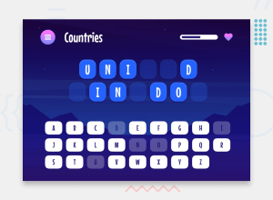
Setting a character limit based on the screen size and hyphenating words that are too long to fit within the container. It took a bit of research and some trial and error to achieve a look that was consistent with the Figma file.
Next time I would look into resizing the placeholders for longer words so they can remain on one line.
What challenges did you encounter, and how did you overcome them?Breaking the gameboard page down into separate components and hooks. Initially, I built the gameboard with all the logic in one file. By the time I finished, it was around 400 lines of code and I could see that it would be difficult to maintain and make changes in the future.
This proved to be a much better architecture when I received user feedback to add an option to go to the next word after completing a game. I was able to easily modify the modal that pops up when the user completes the game.
Community feedback
- P@tsotneforesterPosted 1 day ago
Greate work! 🌟 liked text with stroke made by css, a lot of guys just created .svgs... one minor thing:
- start page is bit tricky in figma: you have placed start card into the center, but here is catch: The Hangman Game logo is also part of it so upper edge of logo and bottom edge of card should be equidistant from screen edges.
0
Please log in to post a comment
Log in with GitHubJoin our Discord community
Join thousands of Frontend Mentor community members taking the challenges, sharing resources, helping each other, and chatting about all things front-end!
Join our Discord
