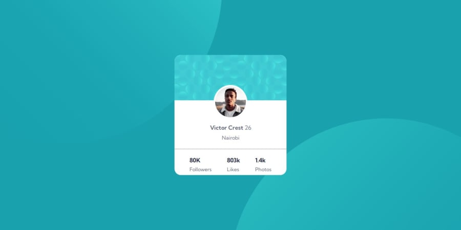
Design comparison
SolutionDesign
Solution retrospective
What are you most proud of, and what would you do differently next time?
i have been able to understand the use of containers and the proper place to place the containers this has helped me to be able to divide my work progressively.
What challenges did you encounter, and how did you overcome them?I had a no challange in this particular state
What specific areas of your project would you like help with?i would like help with the use of git hub and also more use of html and css.
Community feedback
- @Swag-blipsPosted 10 months ago
Hello darren
- Adding More Semantic Elements: Consider using more semantic elements for better accessibility and SEO. For example
- Adding ARIA Labels::Improve accessibility with ARIA labels for important interactive elements.
- Class Naming Convention: Ensure that class names are meaningful and follow a consistent naming convention, such as BEM (Block Element Modifier). For example, instead of ba-img, you could use something more descriptive like card-background-image.
- Accessibility Alt Attribute: The alt attribute in the <img> tag is empty. It's good practice to provide descriptive text for screen readers:
<img src="images/image-victor.jpg" alt="Profile picture of Victor Crest" />0
Please log in to post a comment
Log in with GitHubJoin our Discord community
Join thousands of Frontend Mentor community members taking the challenges, sharing resources, helping each other, and chatting about all things front-end!
Join our Discord
