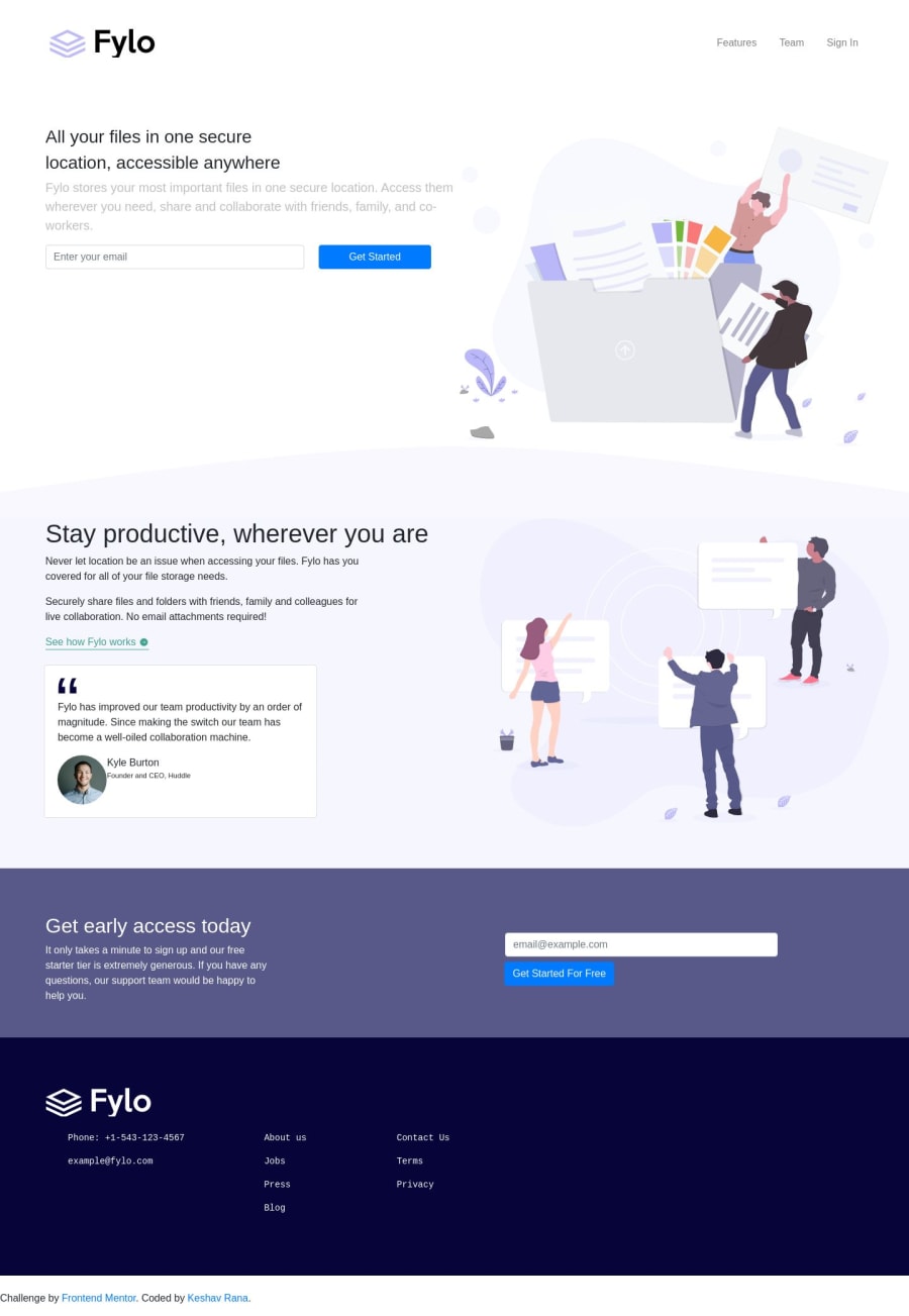
the desktop design is perfect, but some problems if opened in mobile
Design comparison
Solution retrospective
please provide feedback and how it can be adjusted for mobile
Community feedback
- @Batareika007Posted over 4 years ago
Hi ! For mobile it's a good way to use media queries, or use Percentage Padding and Margins of elements.
Website looks not bad, there is some stuff to improve. I saw you using bootstrap (I'm not pro with that) but you can make a lot more. Your last
divused by<pre>, I don't thinks it's a good idea, and it's make impossible to make responsive that part of code.Try to use grid or flex. It will do the work. And dont stop ! you on right way, just need more practices
1@KeshavR-gitPosted over 4 years ago@Batareika007 thanks bro, and I learned a bit about media queries and I think it would be the best solution to make it responsive
0
Please log in to post a comment
Log in with GitHubJoin our Discord community
Join thousands of Frontend Mentor community members taking the challenges, sharing resources, helping each other, and chatting about all things front-end!
Join our Discord
