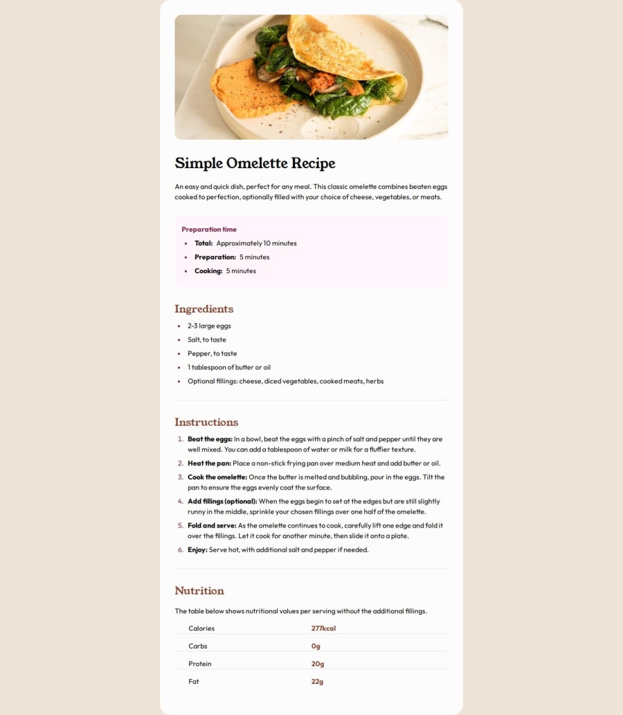
The challenge about replied a recipe page with HTML5 and CSS3
Design comparison
Solution retrospective
I've achieved the challenge focus the second time to desktop view instead of the first time that I tried to develop for the mobile view. I've tried reused styles to reduce the code amount and simplify it.
What challenges did you encounter, and how did you overcome them?The code is fighting with me because I know to centre a div in the screen but this challenge is impossible for me at this time, Can you help me and suggest a solution?
What specific areas of your project would you like help with?With the centre the main div (recipe). I will be very grateful
Community feedback
- @anamaydevPosted about 2 months ago
Hey @apradaglez, I've reviewed your code, and you've done a great job! Don't feel demotivated. To vertically align the
recipe-card, we need to set a specific height for its parent, which is the<body>. Currently, since we’re not assigning a specific height, the<body>tag's height is determined by the content, which is the height of therecipe-card. To solve this issue, you can simply add a margin of 128px (or 8rem) to the top and bottom, which should center the card effectively.Marked as helpful0
Please log in to post a comment
Log in with GitHubJoin our Discord community
Join thousands of Frontend Mentor community members taking the challenges, sharing resources, helping each other, and chatting about all things front-end!
Join our Discord
