


@correlucas
Posted
👾Hi @Levkol, congratulations on your solution!
I’ve few suggestions for you that you can consider adding to your code:
Here's how you can add the hover effect:
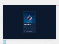
Container needed to position the overlay. Adjust the width as needed
.container {
  position: relative;
  width: 100%;
  max-width: 340px;
}
Make the image to responsive
.image {
  width: 100%;
  height: auto;
}
The overlay effect (full height and width) - lays on top of the container and over the image
.overlay {
  position: absolute;
  top: 0;
  bottom: 0;
  left: 0;
  right: 0;
  height: 100%;
  width: 100%;
  opacity: 0;
  transition: .3s ease;
  background-color: red;
}
When you mouse over the container, fade in the overlay icon
.container:hover .overlay {
  opacity: 1;
}
The icon inside the overlay is positioned in the middle vertically and horizontally .icon { color: white; font-size: 100px; position: absolute; top: 50%; left: 50%; transform: translate(-50%, -50%); -ms-transform: translate(-50%, -50%); text-align: center; }
When you move the mouse over the icon, change color
.icon-eye:hover {
  color:  hsl(178, 100%, 50%, 0.5);;
}
👨💻Here's my solution for this challenge if you wants to see how I build it: https://www.frontendmentor.io/solutions/nft-preview-card-vanilla-css-custom-design-and-hover-effects-b8D1k9PDmX
✌️ I hope this helps you and happy coding!
Marked as helpful
