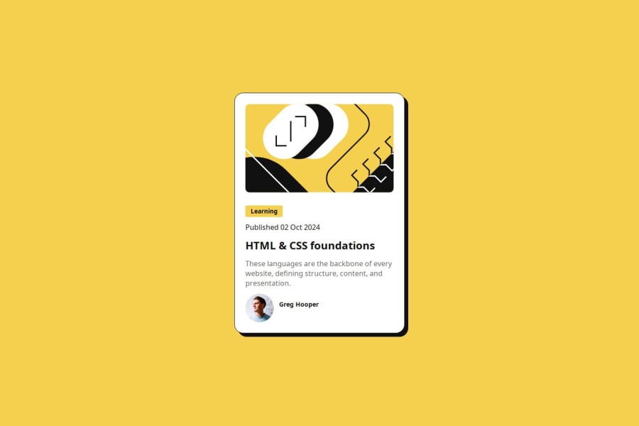
Design comparison
SolutionDesign
Solution retrospective
What are you most proud of, and what would you do differently next time?
I'm very proud that i found a solution how to make the card responsible without mediaqueries.
What challenges did you encounter, and how did you overcome them?I didn't know how to sync height an width to scale responsive. So i started brainstorming with chatgpt and it got me a solution which at first didnt work but helped me figure it out on my own.
What specific areas of your project would you like help with?How else could i have made my card responsive besides mediaqueries and the clamp that i used for die 3 States with "vw" as unit in the middle of it? Is there another way? (I'm sure there is, would be happy if you guys could inspire me :D )
Please log in to post a comment
Log in with GitHubCommunity feedback
No feedback yet. Be the first to give feedback on Car's solution.
Join our Discord community
Join thousands of Frontend Mentor community members taking the challenges, sharing resources, helping each other, and chatting about all things front-end!
Join our Discord
