

Design comparison

Solution retrospective
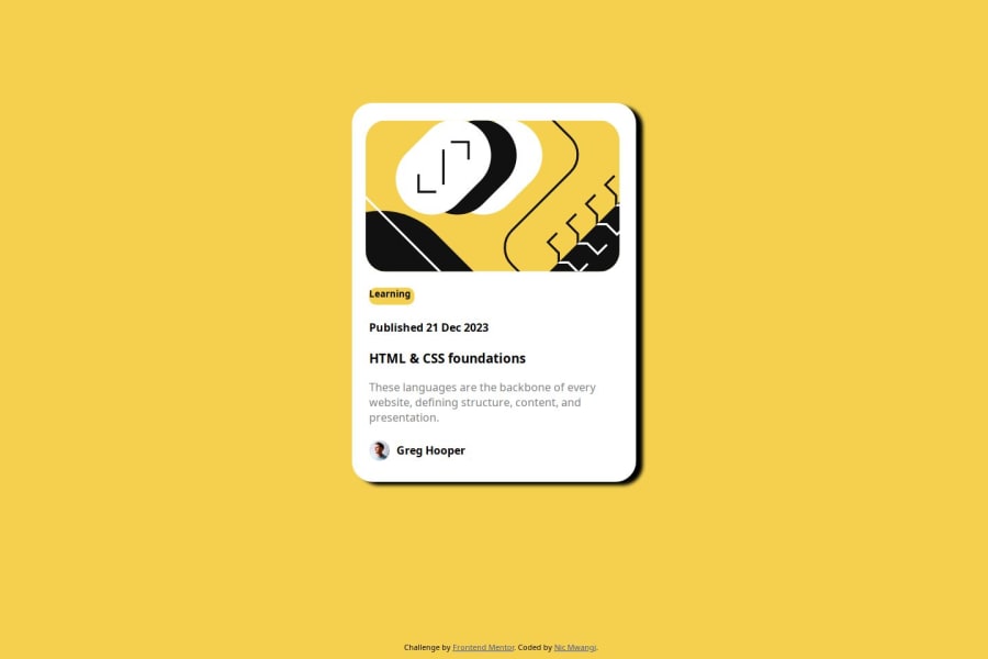
I'm most proud of being able to position my images and my text together in a way that looks similar to the preview. Also I'm proud of the amount of time I spent trying to make it look as best as I can. The thing that I'll do differently next time is making sure that I don't spend too much time on a single aspect of the project.
What challenges did you encounter, and how did you overcome them?One challenge I came across is trying to understand the figma designs and how I implement them into my code. To be honest I still don't understand how developers are supposed to translate the Figma designs to their projects seamlessly. I overcame these challenges most by playing around with my code and googling.
What specific areas of your project would you like help with?I would like to understand how to encapsulate the "Learning" text in my code with color and padding better than what I've displayed.
Community feedback
Please log in to post a comment
Log in with GitHubJoin our Discord community
Join thousands of Frontend Mentor community members taking the challenges, sharing resources, helping each other, and chatting about all things front-end!
Join our Discord