Design comparison
Solution retrospective
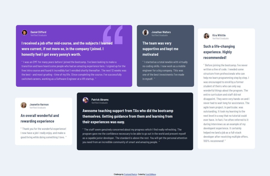
The grid on desktop, become more like a masonry layout rather than a a proper line-to-line structured layout. so if someone could tell me what's going on, I'd would really appreciate it.
Other than that, if there is something you see me doing wrong or if there is a better way to do something please let me know.
I appreciate any & all feedback.
Community feedback
- @Hasani-SediqaPosted 5 months ago
Good job! The design looks good. I think the "Jeanette Harmon" section appears a little smaller. I think if you use these properties for your container, it would work better: " display: grid; grid-template-columns: repeat(4, 1fr); "
1@frost3dWavePosted 5 months ago@Hasani-Sediqa hi! Thank you for the feedback. Do you mean for the mobile view? Cause for the desktop I already have a 12 column layout defined.
0
Please log in to post a comment
Log in with GitHubJoin our Discord community
Join thousands of Frontend Mentor community members taking the challenges, sharing resources, helping each other, and chatting about all things front-end!
Join our Discord
