Design comparison
Solution retrospective
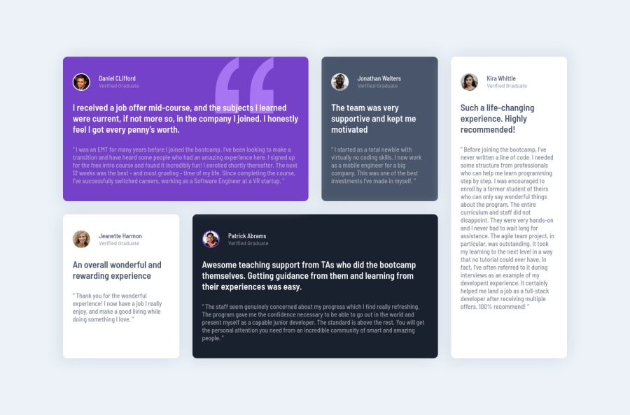
First solution of this challenge. I used old school Html || CSS.. More builds to come 🎉
Kindly review my code, leave a helpful comment 😍
Community feedback
- @vanzasetiaPosted over 1 year ago
Hello, @leorichy99! 👋
Wrap the text with a meaningful element like a paragraph element. There should not be text in
<span>
and<div>
alone.Remove the word "avatar" from the alternative text. Any words that are related to "image" (for example, picture, photo, logo, icon, graphic, and avatar) should not be included in alternative text. It is already an image element (
<img>
) so the screen reader will pronounce it as an image.I recommend swapping all the
<h1 class="testimony-heading">
with<p>
elements instead. There are two reasons for this:- Many
<h1>
elements mean many titles which can confuse the users, especially the screen reader users. - The content should not be a heading. If you want you can make the name of each reviewer
<h2>
.
I hope you find this useful. Happy coding! 😄
Marked as helpful0 - Many
Please log in to post a comment
Log in with GitHubJoin our Discord community
Join thousands of Frontend Mentor community members taking the challenges, sharing resources, helping each other, and chatting about all things front-end!
Join our Discord