Design comparison
SolutionDesign
Solution retrospective
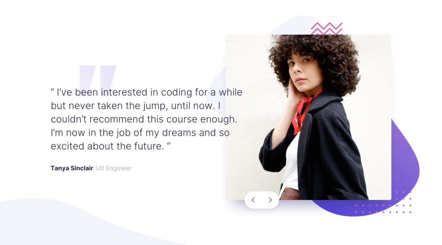
This one has taken me awhile to complete, the graphics were giving me fits and I still haven't got them quite right for the mobile layout, the photo looks ok in the browser but on an Android phone it is squished against the top. Any suggestions or hints as to how to fix this would be greatly appreciated.
Many thanks, best wishes to all for the season (fingers-crossed 2021 will be a big improvement on 2020 for everyone).
Community feedback
Please log in to post a comment
Log in with GitHubJoin our Discord community
Join thousands of Frontend Mentor community members taking the challenges, sharing resources, helping each other, and chatting about all things front-end!
Join our Discord
