Design comparison
SolutionDesign
Solution retrospective
What are you most proud of, and what would you do differently next time?
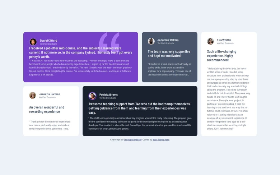
leveraging opacity is nice, didnt know that that would come in handy. i find through grid layout that there is a css "gap" property, for sure useful; i should use that more often over paddings and margins
What challenges did you encounter, and how did you overcome them?this one is not really complex
What specific areas of your project would you like help with?this one is not really complex
Community feedback
- @RadaidehDanielPosted 6 months ago
Good use of grid display. The mobile view is missing.
0
Please log in to post a comment
Log in with GitHubJoin our Discord community
Join thousands of Frontend Mentor community members taking the challenges, sharing resources, helping each other, and chatting about all things front-end!
Join our Discord
