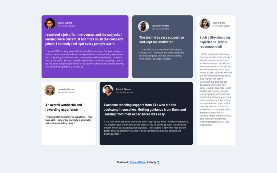
Design comparison
Solution retrospective
A nice challenge to test grid skills. Any advice how to do it with less code.
Community feedback
- @pikapikamartPosted about 3 years ago
Hey, great work on this one. Layout in desktop looks fine, it is just smaller than the original, the responsiveness could be better since right now, if you lower down the screen's width, the elements are squished. The mobile layout however looks great.
You already got a great feedback, just going to add some as well:
- Always have an
h1element on a webpage. Since there is no suitable visibleh1on this, you would make theh1ansr-onlyelement, which the text of theh1describes what is the main content is all about. Take a look at Grace's solution on this one inspect the layout and see how she uses theh1on it, also copy the styling that is applied on theh1, you would need that a lot. - Do not use
vhunit on theheightproperty. This limits theheightof an element, based only to the remaining viewport/screen's height. On your.grid-containerselector, it is better to remove that styling on theheightproperty. - Name for each person could use a heading tag.
- The bold text on the testimonial could be better if it was using just a regular
ptag since it does look like it is just regular text. Using heading tag on the person's name gives it already a defined structure. - Lastly, just maybe making the site more as responsive as you can.
Aside from those, great work again on this one
Marked as helpful1@ZybartasRingysPosted about 3 years ago@pikamart
Hey, big thanks for a nice code review, all topics will help me in my future projects. I did some changes.
I did this h1 with sr-only class, not perfect but i think it will do the job. Removed vh unit on main grid-container and its working fine. Changed all Name to h3 tag looks good. I did some changes to my responsive design, looks better, but not perfect yet :)
0 - Always have an
- @muhammadshajjarPosted about 3 years ago
Hello Zybarkas! Nice work on this one, here are some suggestions which may help you
- Make your
gird-template-columnsto1frso they all equally distribute their widths, Using % and auto will cause issues Check this - It's good to add breakpoint between 700-800px viewport width, because your layout breaks at that point with
grid-template-areasyou would easily achieve another layout check out my solution hope it would help you -Try to addmax-widthto your body or make a container class that wraps your all content, by adding it you can control your content from growing too much on larger viewports - You are switching displays, I think don’t need to switch to flex for the mobile design you can achieve that with grid too -To overcome your accessibility issue you would need to add some semantic markers to designate sections of the page as the header, navigation, main content, and footer e.g:
<main>
<section>
</section>
</main>
<footer>
</footer>
Marked as helpful1@ZybartasRingysPosted about 3 years ago@muhammadshajjar
Hey, big thanks for a nice code review, all topics will help me in my future projects. I did some changes.
i have changed my gird-template-columns to 1fr and its working! i have added one more break point, now its looking way much better when i scrolling down to mobile view, also i added max-width of 1440p to my grid container i hope this will help. I switched to display grid with grid areas and mobile layout looks same, also added some semantics.
0 - Make your
Please log in to post a comment
Log in with GitHubJoin our Discord community
Join thousands of Frontend Mentor community members taking the challenges, sharing resources, helping each other, and chatting about all things front-end!
Join our Discord
